Wednesday, August 10, 2016
2017 Chachi Preview #1 Tommy Joseph
In case you missed it, Topps released the first image of its 2017 flagship set today and the reactions (at least on Twitter) seem to be decidedly negative. The most common criticisms are that Topps seems to be trying too hard and the design would be more at home on a throw-away insert set moreso than the main 2017 base set. I'm reserving judgment for now, and I won't pretend that I won't buy a pack (or 50) when the product is released in the spring. For what it's worth, my nine-year-old son took one look at the mock-up and proclaimed, "I love it!" So it would seem as if Topps is doing something right.
In any event, I've used the occasion of Topps releasing its first first preview image over the past few years to slightly steal the company's thunder and release a preview image of next year's Chachi set. After being all but completely certain that I'd use the 1971 Topps design for the 2017 Chachi set, I went and completely changed my mind a few weeks ago and landed on the 1982 Topps design. (The 2017 Chachi Set Planning Committee seems indifferent to this decision, what with various non-stop summer activities occupying their time.)
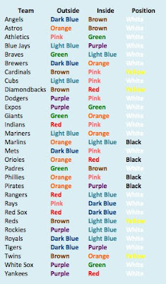
The main reason for this decision is that I miss color. I've enjoyed working with the 1970 Topps design this year, but it's main color component (gray) leaves a lot to be desired. With the 1982 Topps design, I'll get pinks, oranges, greens, browns and different shades of blues. Looking at the original color combinations used by Topps in 1982, I've already come up with the color combinations I'll use if I endeavor to create custom cards for players on the Marlins, Rockies, Rays or Diamondbacks. And in case you were wondering, the only two teams with the same 1982 Topps color palettes are the Expos and White Sox.
The one design element I haven't finalized yet is whether or not I'll tackle the challenge of having facsimile autographs on the 2017 Chachi cards, just like the originals. This seems like a daunting and time consuming exercise to me, so I'll most likely forego the facsimile autographs as I've done with past Chachi set releases.
If the 2017 Topps design has you down, get ready to enjoy a whole lot of 1982 Topps here at The Philies Room next season. If the 1982 Topps design has you down, I'm afraid there's no hope for you.
Memory Lane
2014 Chachi Preview #1 (8/8/13)
2015 Chachi Preview #1 (8/15/14)
2016 Chachi Preview #1 (8/11/15)
2017 Chachi Preview #1 (8/10/16)
Labels:
(Tribute),
1982,
2017 Chachi Set Inserts,
Joseph T.
Subscribe to:
Post Comments (Atom)


5 comments:
A fine choice, I am looking forward to it... but I reserve the right to get a little pouty over there not being a vote, even if the vote were a dog and pony show which has no bearing on reality.
I don't hate 2017 Topps... I'm not sure how much I like it, but I find it interesting and I'd like to see more samples... Plus you just never know what they really look like until they're in your hands.
Ha! I was planning on running a vote (albeit a fake one), but then the preview date of 2017 Topps just snuck up on me. I still have the 1978 set just taunting me with its blasted custom team-name font! One of these years . . .
For what it's worth Topps doesn't always add the facsimile autograph on their own 1982 Retros --> http://phungo.blogspot.com/2008/07/1980-topps-tch-69-robinson-cano.html
Well if we don't get a vote, then I'll do a ranking on my own.
I'll be nice and exclude two sets that would induce excessive greying of hair (1978 and 1972). For the remaining six un-Chachi-ed 1970's and 1980's Topps sets, I'd rank them as follows: 1982, 1971, 1986, 1987, 1984, 1989
Phungo - I was thinking of maybe doing a few ultra-rate auto variant cards, and inserting them randomly in retail only blaster boxes . . .
TSR - I like your ranking! I think my ranking is similar right now, although it could change - 1982, 1971, 1987, 1984, 1986, 1989.
And here's some insider scoop . . . We've formed an exploratory committee to take a look at possibly branching out to the 1960s, 1990s and (gasp) other brands. 1965 Topps, 1991 Topps and 1982 Donruss are all being discussed with select focus groups in the midwest. I'll be very interested to read the notes from these focus groups.
Post a Comment