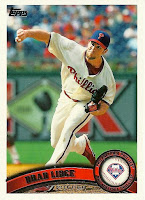
I've read through a lot of bloggers' posts regarding their thoughts on the 2011 Topps set, and I feel as if I've seen pictures of just about every base card and insert at this point. My initial thoughts on the set are similar to how I felt about the 2010 set - I like it. For me personally, the front of a successful modern-day baseball card should possess four things:
1. A nice picture of the player: From what I've seen, it looks as if Topps really paid attention to its photography and picture selection in this year's set. I especially like that you can see the "HK" on the outfield wall behind Brad Lidge, paying tribute to Harry Kalas who passed away in 2009. Topps must have Photoshopped out the "HK" patch on the front of Lidge's jersey.
2. The player's name is legible: Check.
3. The player's position is on the front of the card: It's hard to see on this Lidge card, but it does list him as a pitcher below the banner with his name. Cards without players' positions on the front upset me.
4. The team's primary colors are represented: Check. And as a bonus, the player's team's logo is on the front of the card.
 If I could change one thing about this design, I'd have the team city at the top of the circle surrounding the team logo, and I'd have the team name at the bottom of the circle. Writing out "Philadelphia Phillies" at the top and bottom seems crowded and redundant.
The backs are unremarkable, but they'll do. I like the easy to read number in the top right corner and I'm OK with Topps repeating the picture from the front in the top left corner. Maybe I've missed it, but I haven't read any commentary on the little blurb contained on the right side panel of each of the card backs. The Lidge card contains this passage: "In the 2000 Topps set, card number 242 was David Wells." How did Topps decide to go with this card in the write-up? Does the 2000 Topps set contain the best card #242 in Topps' sixty year history? In any event, it's quirky, so I've decided I like this. I'm hoping it's only a matter of time before some other obsessive compulsive blogger decides to put a list together of the cards mentioned on the backs of the 2011 Topps cards.


1 comment:
I've got several 2011 Phillies available for trade if you want them, including a few inserts. Let me know. jasontcarter at gmail d0t c0m
The Writer's Journey: 2011 Topps tradebait
Post a Comment