|
|
|
|
1980 Topps - Design already used for the 2009 Chachi set.
1981 Topps - Design already used for the 2006 Chachi set. Here's a little secret though . . . If I ever feel the need to go back and use a design for a second time, this would be the set I'd go back to. I just love the little hats.
1982 Topps - I had once openly mocked this set's design as I just didn't think the pink and orange color scheme that Topps chose for the Phillies in this set would ever work with modern photos. I'm completely re-thinking that prejudice and I'm shocked that this set has now crept to the top of the "defiintely possible" list for the 2016 Chachi set.
1983 Topps - Design already used for the 2011 Chachi set.
1984 Topps - I don't mind this design, but I'll let you know that finding two photos of some of the more obscure Phillies for the 2011 Chachi set was a royal pain. (I'm looking right at you, Mike Zagurski.) I can't imagine the 2016 Phillies are going to field a team of well known players with readily available photos, so I may need to pass on this design for a few more years.
1985 Topps - Design already used for the 2015 Chachi set.
 |
| 1989 Topps #438 |
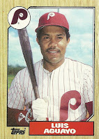
1987 Topps - This is a great design and I'd love to finish up my project of creating a 1987 Topps style font. I've got a good start on this project, but I just need to find a spare day to wrap it up. I'll use this design at some point, but probably not in 2016.
1988 Topps - Design already used for the 2014 Chachi set.
1989 Topps - This set's design has never been one of my favorites, and it would be tough to replicate the script font used for the each team's name. I've tried creating custom 1989 Topps cards before and I had a tough time with the spacing of the letters in each player's name. Cross this one off the list for the foreseeable future.


5 comments:
Of the 1980's designs remaining, I'd actually lean towards 1982, regardless of the challenges some of the other sets pose. 1986 or 1987 would be fine.
I'd still probably go with one of the 1970's sets over any of these options.
Before you did the 1989 set, I'd suggest relaxing the rules a bit on the brands or years open for "Chachi-ing", because my disdain for 1989 Topps is growing with each passing year. There are a number of Fleer or Donruss design that are better than 89T.
Between you and me (and whoever else reads this comment) I'm leaning towards using either the 1970 or 1971 Topps design. It's going to be another long season for the Phils (again) and I at least want to have fun with the design I'm using for the 2016 Chachi set.
And I'm with you on expanding the Chachi set template rules. I personally have always loved the 1981 and 1982 Donruss designs, probably because they both remind me of my first few years of being a "serious" collector.
1971 is perhaps my favorite design post-1960s, so I like that choice! 1970 is good too. If you really want to shake it up, use the very dated 1990 design.
I'll need to be very desperate before I use the 1990 design!
Some day that 1990 design will be a big hit! Although perhaps it will take until we have flying cars....
Post a Comment